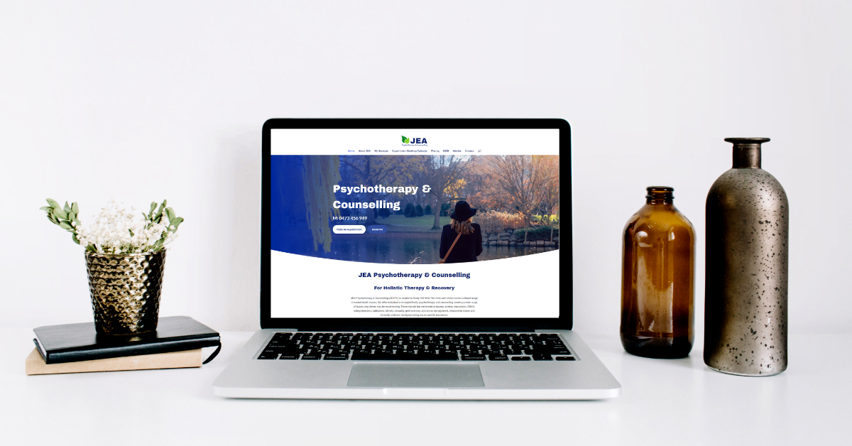
Clean minimalistic web design is carefully planned by designers to improve the effectiveness of a website by adopting a process of streamlining content to make it more inviting with the removal of unnecessary elements. Effective clean styling options are also aimed at refining web pages for an optimised and engaging user experience and may have a positive effect on a website’s ranking according to Google algorithms.
What does clean web design look like?
Every component must be carefully selected such as layout, visual style, fonts and web content. They will work to build trust in your business by playing a significant part in the way your target audience reacts and connects to your brand.
Think of your website visitors as window shoppers. Their experience needs to be considered a priority to be factored into all areas of web design, particularly for the purpose of leaving a lasting positive impression. Windows are described in the dictionary as being a point of view.’ Ironically it is a website visitor’s point of view that matters most when they land on a web page.
Keep in mind that the clean website provides a comprehensive presentation for page visitors and its simplicity works to eliminate user frustration.
Your brand identity is reflected in all aspects of design and must remain consistent. How your web content speaks to your audience becomes increasingly effective when site visitors feel an emotional connection.
To Make A Clean Website
- Use more than three colours in the design. Two colours that compliment each other and one contrasting colour.
- Avoid colour transition, shadows, textures or excess detail.
- no extra buttons
- lots of empty space
Design Tips To Consider
- Keep all page text concise and to the point. Take the time to plan your content carefully.
- Use stand-out fonts that work well together and look amazing.
- Carefully choose images as photos create an emotional connection. Add alt-text and size images correctly, as image sizes have a direct and profound impact on a page’s load speed. For businesses requiring the use of countless images, such as Photographers or in the case of eCommerce websites. I recommend the use of an image optimizer plugin.
- Make sure buttons are highlighted when users hover over them. Use two contrasting colours within your branding.
- Use up to 3 colours in your branding. The overuse of colour can be off-putting and depending on the design can make a brand or site look unprofessional.
Although the minimalist approach works in favour of search engine performance, making the site too minimalist by leaving out crucial information can have a negative impact on your site’s search engine results. Therefore plan your page carefully. Ask yourself, “What do others need to know about my business, services and products first and foremost?”

